What We Viz With
This is a networked visualisation of the various tools that members of the Data Visualisation Society (DVS) use, and the connections between the tools themselves. I worked on this as an entry to the DVS’s annual competition in 2019. You can view the gallery of submissions here.
The visualisation is linked below:
Try zooming out in your browser for best results.
“Who Does Data Viz?” “Where do they do it”? “What do they do it for?” “What tools do they use?”
The answers to these questions, and many more posed as part of the 2019 Data Visualization Community Survey, are growing more and more diverse over the years.
This visualization explores the diversity in the answer to the last question, in ‘What We Viz With’.
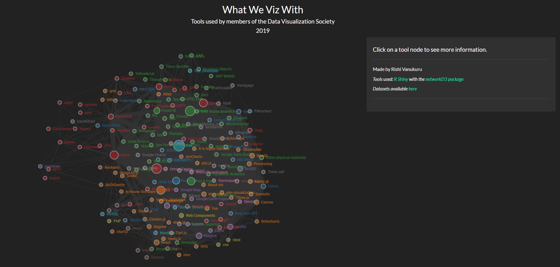
In all, the respondents of the survey listed 180 distinct tools that they use while making visualizations, and all of those tools are visualized here as a force-directed network.
Details:
Hover over a tool to see what other tools have been used along with them. Click the nodes in the network to get more information about each tool.
Click and drag the nodes around to see things better. You can pan by clicking the background, or zoom in and out of the network by scrolling.
In some browsers, zooming out of the whole page might produce better effects.
Process:
While going through the survey responses, I noticed that while the question that asked members to pick which tools they use had about 40 options, there were 180 distinct tools that were mentioned across all respondents. I had never heard about a lot of these tools, and it was really interesting to see which tools were used in unison with which other tools. After an initial exploration phase in a spreadsheet program, I decided that a network visualization might be a good way to go ahead.
After a lot of experimentation, I settled on implementing the network in R, and hosting it online as an R Shiny application. It is a force-directed graph where each tool is a node. This allows for some really nice interactions - dragging nodes around to see links better, and hovering over nodes to see which other nodes are connected to them, to mention a few.
In terms of the visualization itself, the size of the node represents the number of respondents using a particular tool. The thickness of the link between two nodes represents the number of people who use both tools. The color of the nodes is derived from an ordinal color scheme to represent the 14 different categories of tools (that I defined myself to make things easier to understand). Clicking the node brings up information on the group it belongs to, the number of respondents who use the tool, and a link to read more information about it.
Discovering new tools, seeing how groups of tools are used collectively, or just playing around with the graph to understand the links better - these are some of the scenarios that I hope readers will find themselves in while interacting with the visualization.